GeekTyrant V3 a VISUAL WALKTHROUGH
It's been just over a week and the reaction to the new V3 has been amazing. The amount of traffic on the site has grown over 200% and subscribers to our RSS have grown 500%.

The biggest change is invisible but very important, and that is SPEED. The site now loads about 900% faster and is Digg/Stumbleupon proof; high traffic won't bring down the site.
The most noticeable and functional change are the tags. Before they were a rainbow of unorganized color whose presence was weak and confusing. Now they have a clean logic.

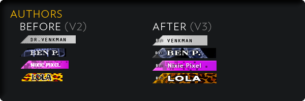
The author tags also got a visual update to help you further distinguish between our contributing staff who offer a wide variety of opinions and info.
Here at GeekTyrant we post a daily average of 12+ posts. So we punched up the calendar and made the date bigger.

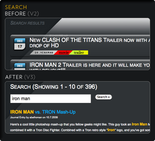
The Search feature on the old site was a pain and never really worked well. GeekTyrant's V3 search is amazingly superior, allowing you to locate the content you're looking for quickly.
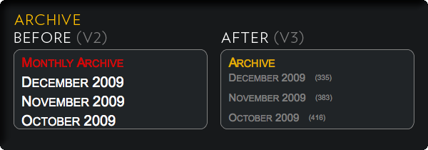
We have also said goodbye to our rich footer and moved its content into the sidebar. Our monthly archives now display the number of posts in each month.
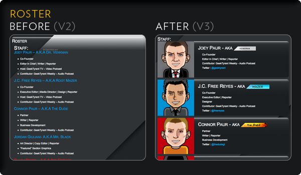
Our old About Page was admittedly a bit plain. We've cleaned things up and added some visual aids to help make it more fun to look at as well as more informative.

The previous roster page was just text and kinda boring. Now you can see the cartoon versions of the writers for the site.
Pagination got an extra touch of usability.

Simple contact form for those without a built in email client.
The date, author tag and category tag are at the top of every post now.
References and sources are now clearly indicated.

We hope you enjoy all the work we have put into the new GeekTyrant V3.
Many of the upgrades are only possible because of Squarespace.
Next week the epic battle Squarespace VS Wordpress