The Sequel Map: Are Sequels Truly Better or Worse than Their Originals?
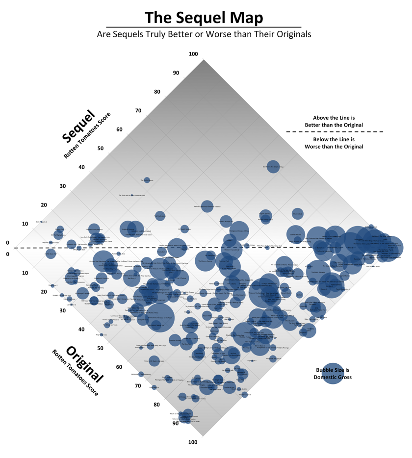
This chart was created to give us a visual look at what sequels are better or worse than the original films.
The scores on the chart come from Rotten Tomatoes with the originals’ scores on the X-axis, and the sequels’ scores on the Y. Films at the center line are sequels with the exact rating as the original; films above are sequels that have surpassed the original; films below, ones that fared worse. The bubble size is the domestic gross.
Here's a note from the charts creator,
Categorization of sequels is sometimes more art than science, so I’ve had to follow a few rules: I’ve only included the second film in any series, never third or following films. I haven’t included remakes or “reboots,” and I’m only presenting films which opened (at some time) in the US and have Rotten Tomatoes ratings.
Click the image above for the larger version.
