Typo Movie Poster Art
Yeah, so here is a interesting collection of movie poster art that I thought some of you might think is cool. This cleaver poster art was created by Patrik Svensson who worked on basic typography signs to create them.
Here's a note from the artist:
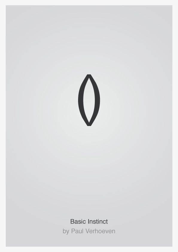
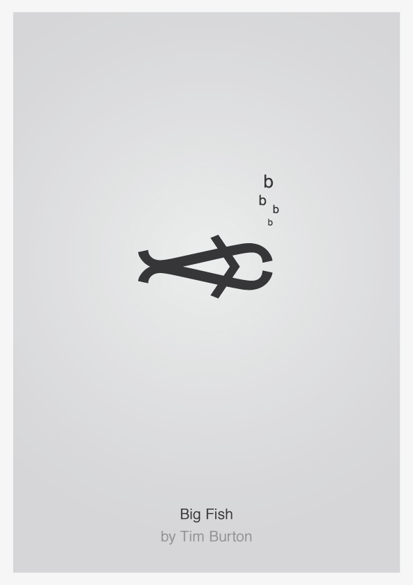
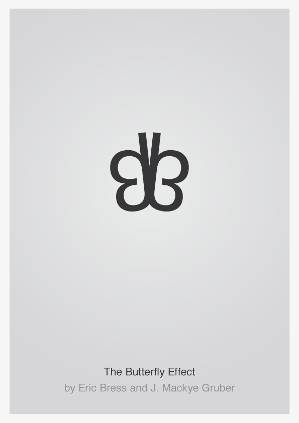
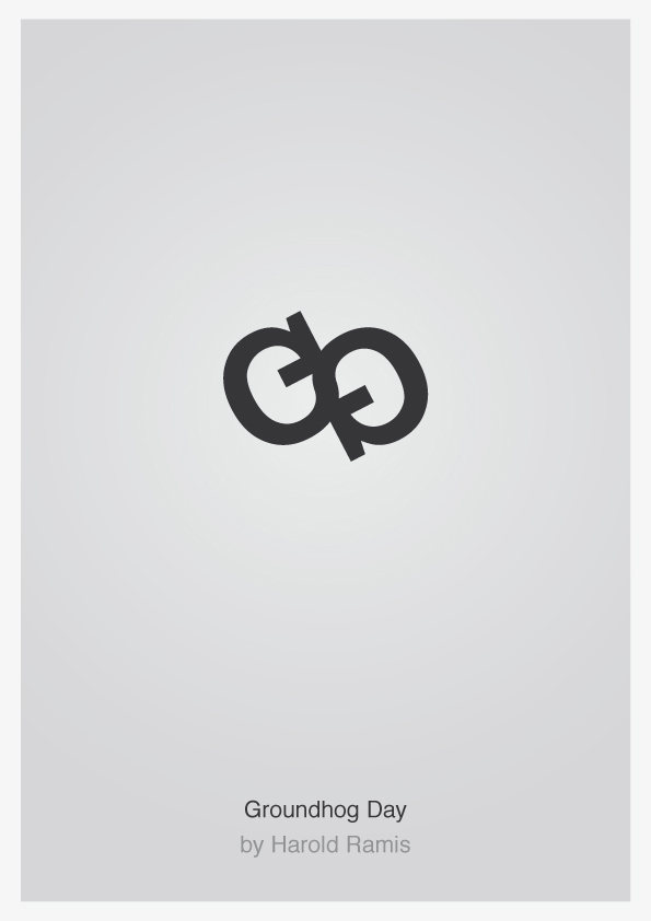
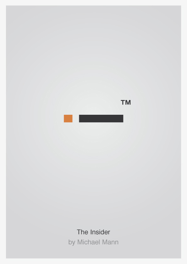
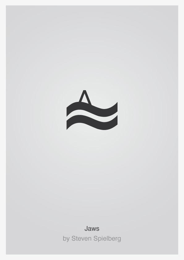
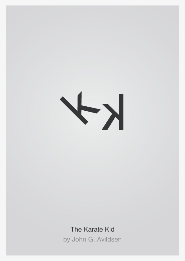
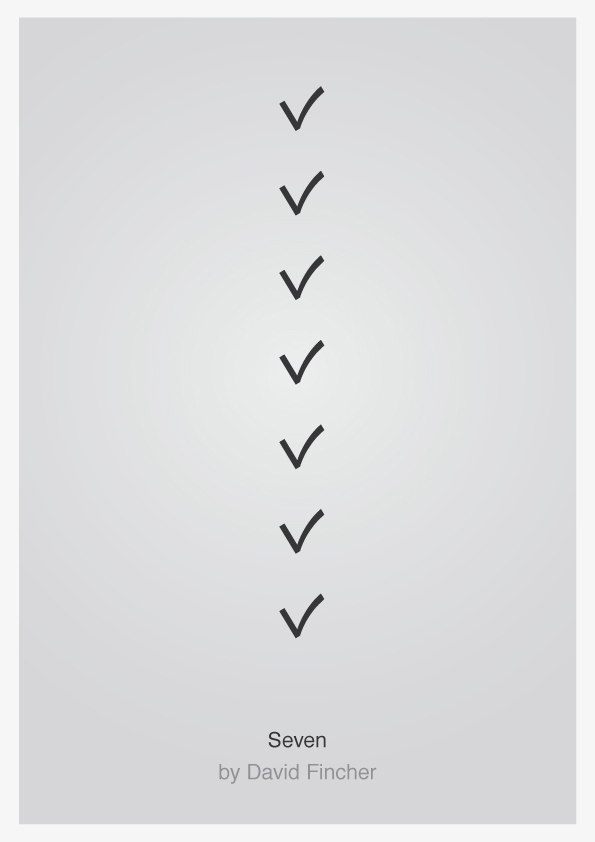
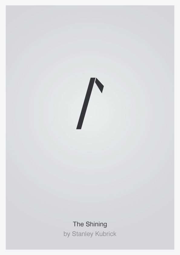
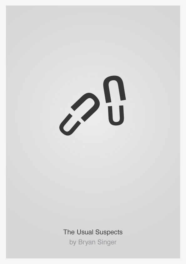
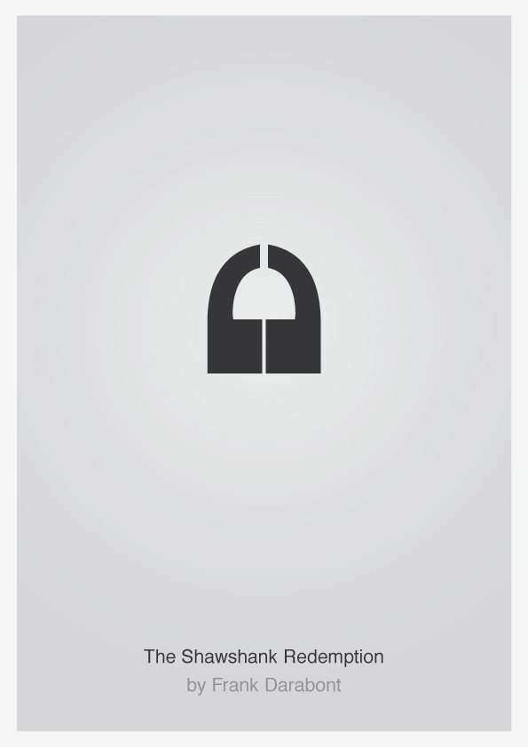
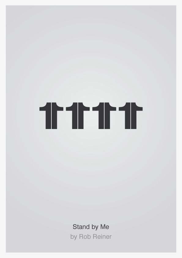
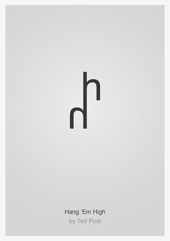
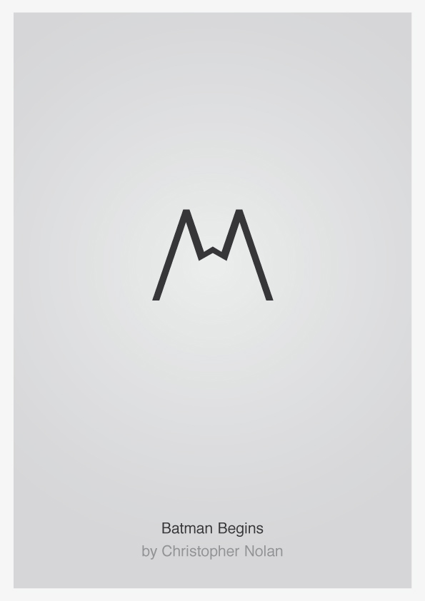
It’s a visualisation of the movie by using only first letter(s) from title, for instance the i from “The Insider” as the shape of a cigarrette, or the two k’s from “The Karate Kid” as two fighting karate kids.
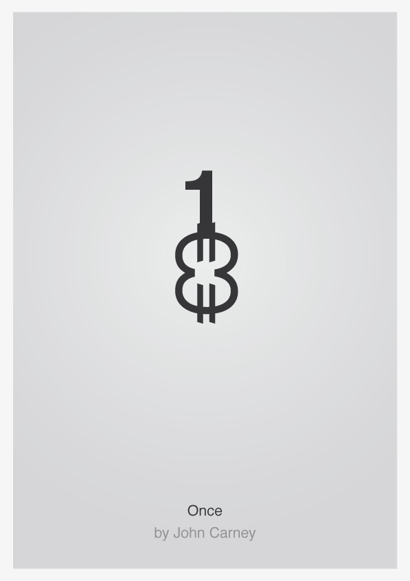
The rules are strict, but in some cases I have used more general typography characters to visualise the movie. “Once” is an example where two Euro signs along with the number 1 take the shape of a guitar. (I might reveal “Once” is about a guy who plays the streets for money for you who didn’t see the movie…)
I think it was the strict rules I set up for myself that draw me to this project. I have always been a fan of designers that integrate with the viewer to create a sort of game together. I always strive to leave some space for the viewer to fill. It’s a balancing act. The humour is also very important–graphics without a sense of humour is often dead to me.
Check out the Typo movie poster art below and tell us what you think!