New Set of Retro STAR TREK Art by Juan Ortiz
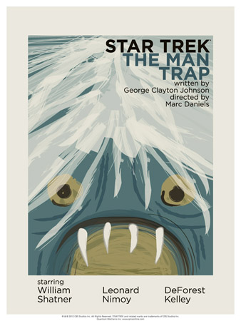
Artist Juan Ortiz has started an epic art project in which he will create a series of 80 poster designs--one for every episode of Star Trek: The Original Series. He releases four of them every month, and will do so over the course of 20 months. Here are the latest additions featuring his very cool retro style.
To look over the previous poster art, click here and here. I've included descriptions and artist comments below each piece. The description directly below is for the poster above.
Episode 1: The Man Trap. "I tried to picture what Kirk's view was while he was having the salt sucked out of him," says Ortiz of this tale of a deadly shape-shifting creature that needs salt to survive. "By filling the page up completely, I hope to give the viewer the sense of being smothered or trapped."
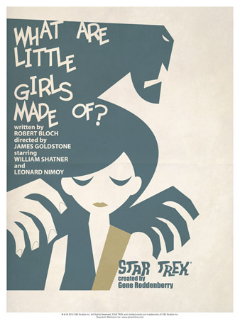
Episode 7: What Are Little Girls Made Of? Nurse Christine Chapel is reunited with her missing fiancé on Exo III, but the scientist's obsession leads him to make an android duplicate of Captain Kirk. Ortiz comments, "Just having Ruk (a massive android bodyguard) with that title would have been creepy enough, but having his shadow loom over Andrea (the scientist's comely assistant) creates more drama. I also thought about Frankenstein a bit while I worked on this one."
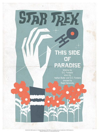
This Side of Paradise. Flower power is vividly on Omicron Ceti III, where plant spores keep colonists healthy, blissful and placid, despite radiation from deadly Berthold rays. Enterprise crew members fall under the influence of the spores, including Spock, who feels love and struggles to return to his post. Says Ortiz, "The hand symbolically represents Spock, having rejected love, reaching out from paradise for life aboard the Enterprise and his pursuit of logic."
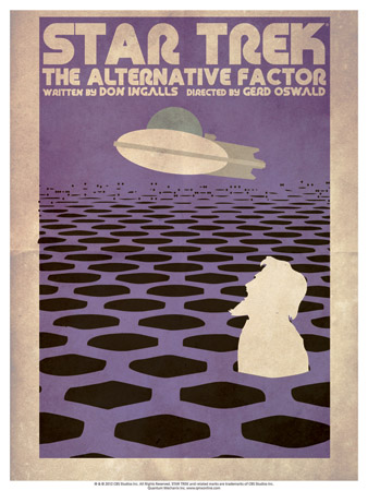
Episode 27: The Alternative Factor. The Beatles' musical fantasy film Yellow Submarinemeets the The Who's rock musical Tommy in this print. Ortiz notes, "Lazarus' time ship reminded me of the Beatles' yellow sub, so I went with that in mind and with the sea of holes representing the doorways through time."
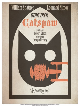
Episode 36: Catspaw. Here the artist wanted a stark, bold look, with the Enterprise in the cat's mouth. Says Ortiz, "I think that's the playful part, sort of a 'look what the cat dragged in' moment. Staring out the window and seeing empty eyes reflecting back at you creates that eerie feeling."
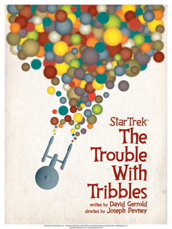
Episode 44: The Trouble With Tribbles. "The Enterprise is metaphorically bleeding Tribbles," says Ortiz. "I wanted the poster to be fun and colorful, and hopefully [to] make people smile."
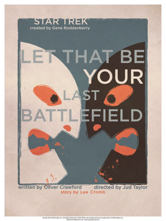
Episode 70: Let That Be Your Last Battlefield. "Before I upset any fans," explains Ortiz, "I intentionally flopped the colors so that the white and the black could face each other." He adds, "I used the exact same face for both faces, which I hope demonstrates the absurdity of racism. I kept the faces as simple shapes so that the rage between the two, defined by the touches of red, would translate better."
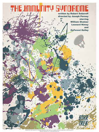
Episode 47: The Immunity Syndrome. Here Ortiz has drawn a representation of the gigantic energy-draining amoeba that threatens an entire galaxy. He says, "The paint splatters are actually fonts or dingbats. The only laborious part was arranging and colorizing the splatters into a layout that fell into an organized mess."