Disney’s Classic Animated Movies Lost Their Visual Magic on Streaming, and Here’s Why
If you remember classic Disney animation looking richer, warmer, and far more colorful in theaters, your childhood memories aren’t playing tricks on you. Those movies really did look different.
A fascinating comparison from Animation Obsessive puts theatrical 35mm footage from Disney films next to the digital versions currently available on streaming, and the difference can be pretty brutal.
Movies that once had intense reds, glowing fire, rich shadows, and warmer skin tones can now look surprisingly pale and muted.
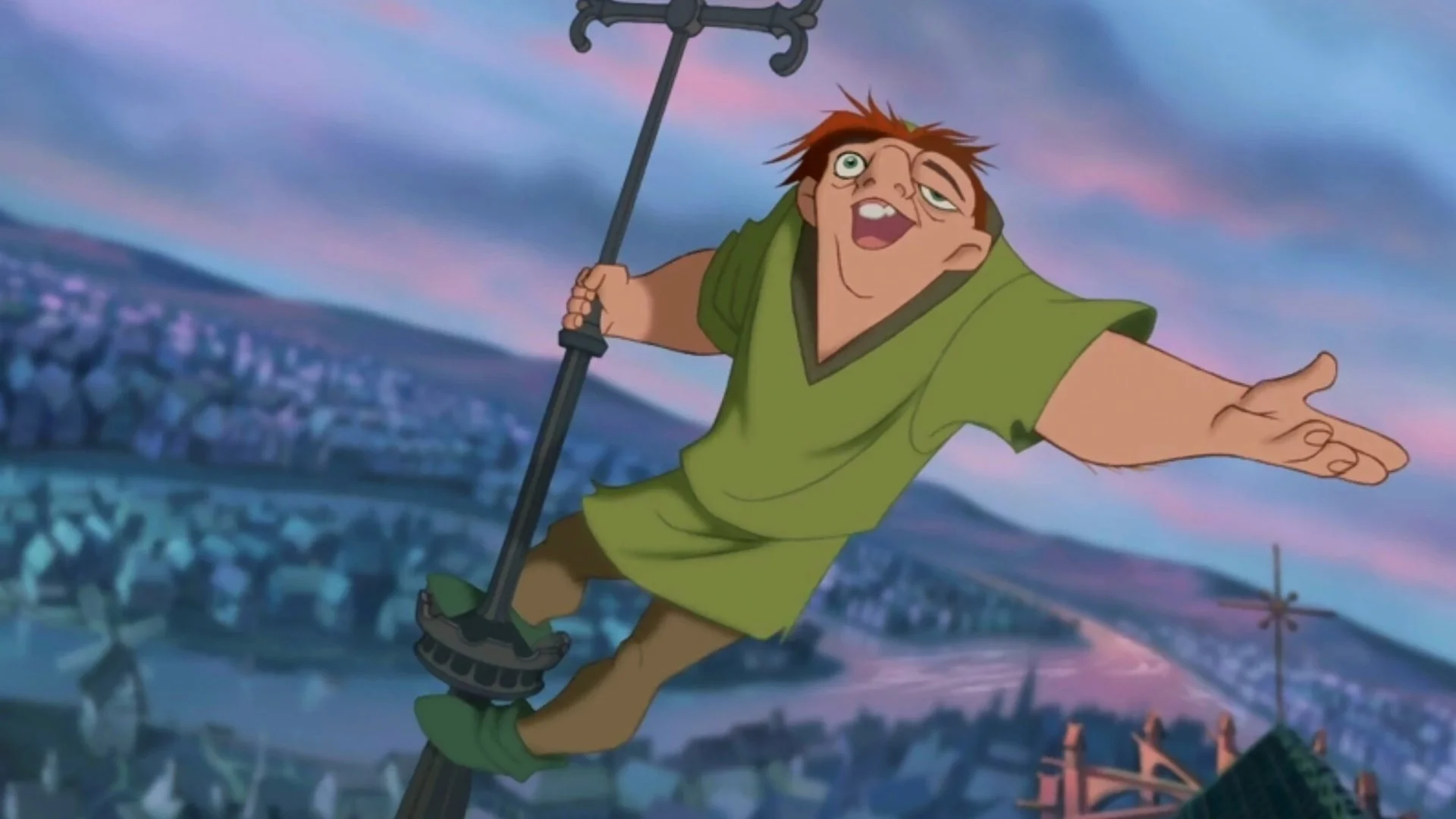
The comparison includes Hercules, The Hunchback of Notre Dame, and other Disney Renaissance films, showing how dramatically their appearance changed as they moved from 35mm film to modern digital releases.
The fire in The Hunchback of Notre Dame is an especially strong example. In the film version, the reds and oranges practically burn off the screen. The streaming version looks flatter and cooler by comparison.
Similar changes can be seen across other scenes, including characters whose skin tones appear noticeably paler in their current digital presentations.
Animation Obsessive explored the issue in detail and pointed to a key reason for the change and that is these Disney animated movies were created with their final film presentation in mind.
The artists knew their work would ultimately be photographed and projected on celluloid, so color choices were made around the characteristics of that process.
What audiences saw projected from 35mm wasn’t simply a neutral reproduction of the artwork. Film stock, printing, projection, and the rest of the theatrical pipeline contributed to the finished image.
When those movies were later converted for digital presentation, that relationship changed. A digital master viewed on a modern display doesn’t automatically recreate the appearance of a 35mm theatrical print. Without careful restoration and color grading intended to preserve that original look, some of the richness can disappear.
That helps explain why streaming versions can feel visually different even though you’re technically watching the same movie.
It’s also why the issue isn’t quite the same for computer-animated films from Pixar. Movies created digitally from the beginning were developed around a computer-based workflow, so bringing them to modern digital platforms doesn’t involve recreating the visual characteristics of artwork originally intended for a photochemical film process.
“I have tears in my eyes. I saw ALL these in theaters as a child, and yes, THIS is what these films looked like!” wrote @fanime_1. “This is what I remember! I thought maybe it was just rose-tinted glasses, but no, these transfers need to be improved!”
@ju1fy had an equally great description of just how different the images look: "That Hunchback fire comparison is brutal—the 35mm glow feels hot enough to singe the frame, while the stream looks weirdly refrigerated."
When you put the versions beside each other, this stops feeling like a minor color-grading complaint. The atmosphere of a scene can actually change. Fire doesn’t feel as hot, shadows don’t feel as rich, and colors that helped give these hand-drawn Disney movies their personality lose some of their punch.
Disney does have an interesting new project on the way that embraces some of the texture associated with traditional animation. Enrico Casarosa is directing Gatto, an animated film that combines 2D hand-painted textures with modern CGI.
The movie follows Nero, a black cat living in the superstitious city of Venice, Italy. Because Gatto is being produced with modern digital presentation already part of the equation, its filmmakers can design its colors and textures around how audiences will actually see the finished movie.
Films such as Hercules and The Hunchback of Notre Dame were created for a specific visual medium, and moving them into another one without faithfully reproducing that theatrical appearance can change the artwork audiences originally experienced.
For anyone who grew up watching these movies on the big screen, the 35mm comparisons are both awesome and a little painful. They’re a reminder of how gorgeous Disney animation could look when those colors were presented the way the filmmakers expected.
Hopefully Disney eventually gives these classics digital restorations that get closer to their original theatrical presentation.
If streaming is going to become the primary way future generations discover these movies, they should at least get to see why they looked visually so good in the first place.