GeekTyrant Design-V10: Fullwidth Mobile to 4K

My earliest memory of entertainment news came in the form of Premiere magazine. It was bigger and glossier than the other movie magazines, some would say oversized, images inside went full bleed to the edge, it was a gorgeous magazine — those core design ideas have influenced every single design of GeekTyrant.
The previous design version 8 completed in 2015 was starting to show it's age. (Design-V9 is used on GameTyrant) The number of new mobile screen widths was making our ridged breakpoint heavy mobile code bloated. Also, the affordability of 4K screens started a growing number of readers with massive screens.
Knowing that I needed the reader feedback and time to make fixes, we launched the newest design for GeekTyrant late at night on June 7th. All you readers on Friday were basically beta testing the website. I spent Friday evening and the entire weekend fixing lots of bugs I just couldn't have tested for. So far the design has been very polarizing, which could be due to bugs, and just the new layout for larger screens.
The following are screenshots of how the site's design has evolved and changed from V8 to V10.
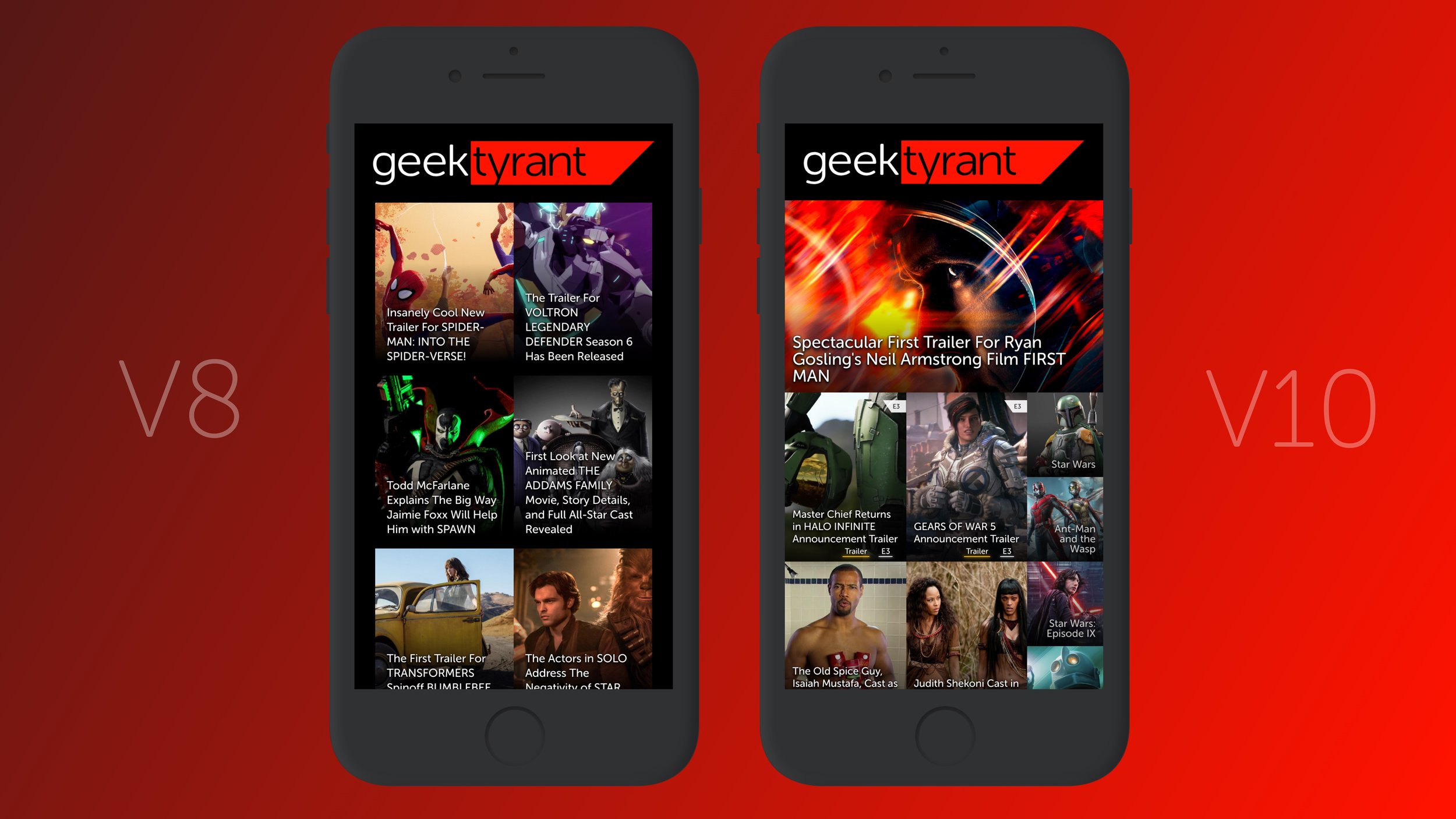
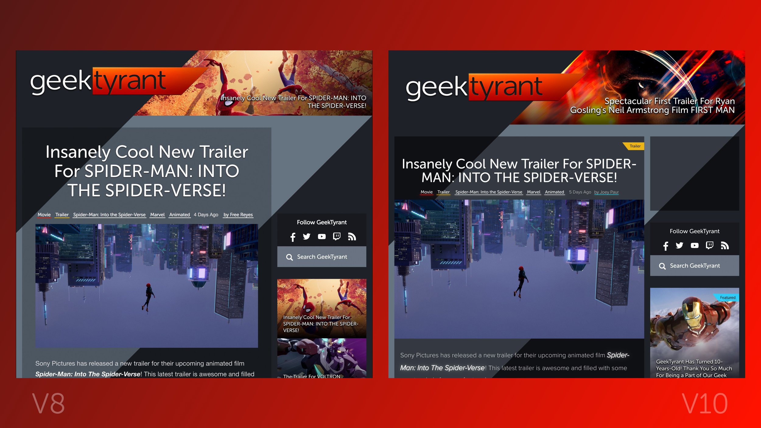
Fluid Mobile Layout
The mobile layout of the site makes better use of the width of the screen. If you have an iPhone Plus or large Android Phablet you paid extra for those pixels we make better use of them. V10 also introduces the "Featured Post" and "Post Collections" to the homepage so you can dive deep into the upcoming movies or collections like Trailer, Videos, and Art.
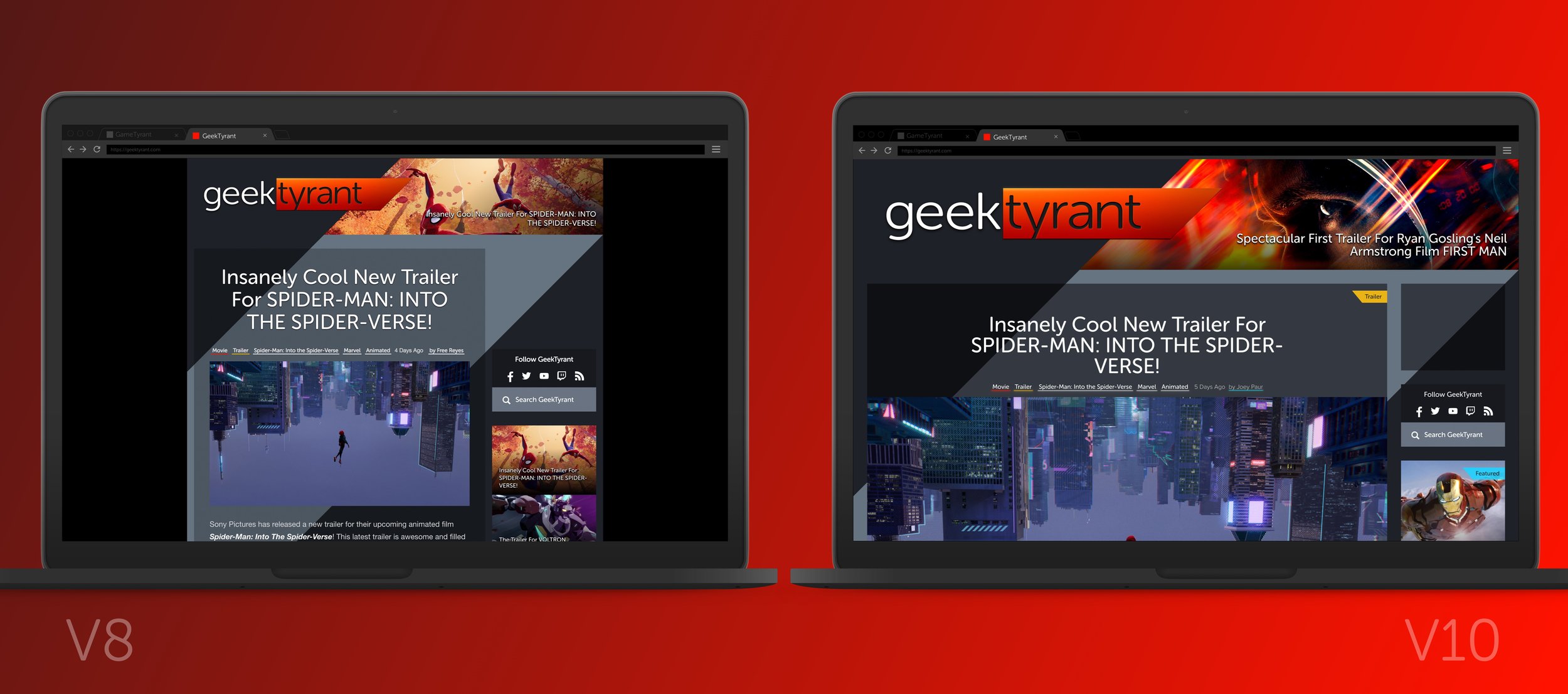
The Same But Different
If your browser window is 1200 pixels wide you will see some minor changes, images are a bit larger, typography is more refined. But the layout is mostly the same.
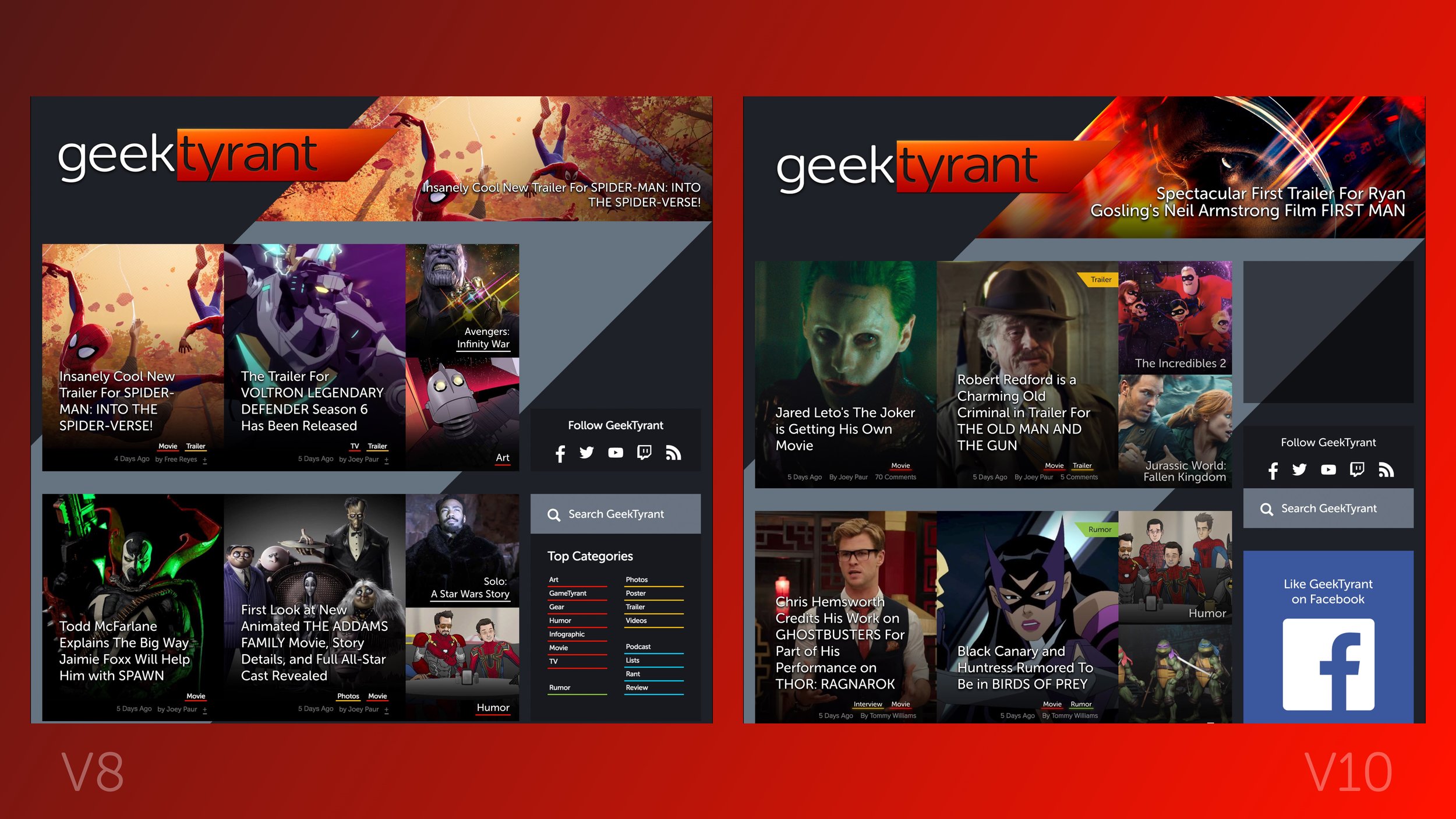
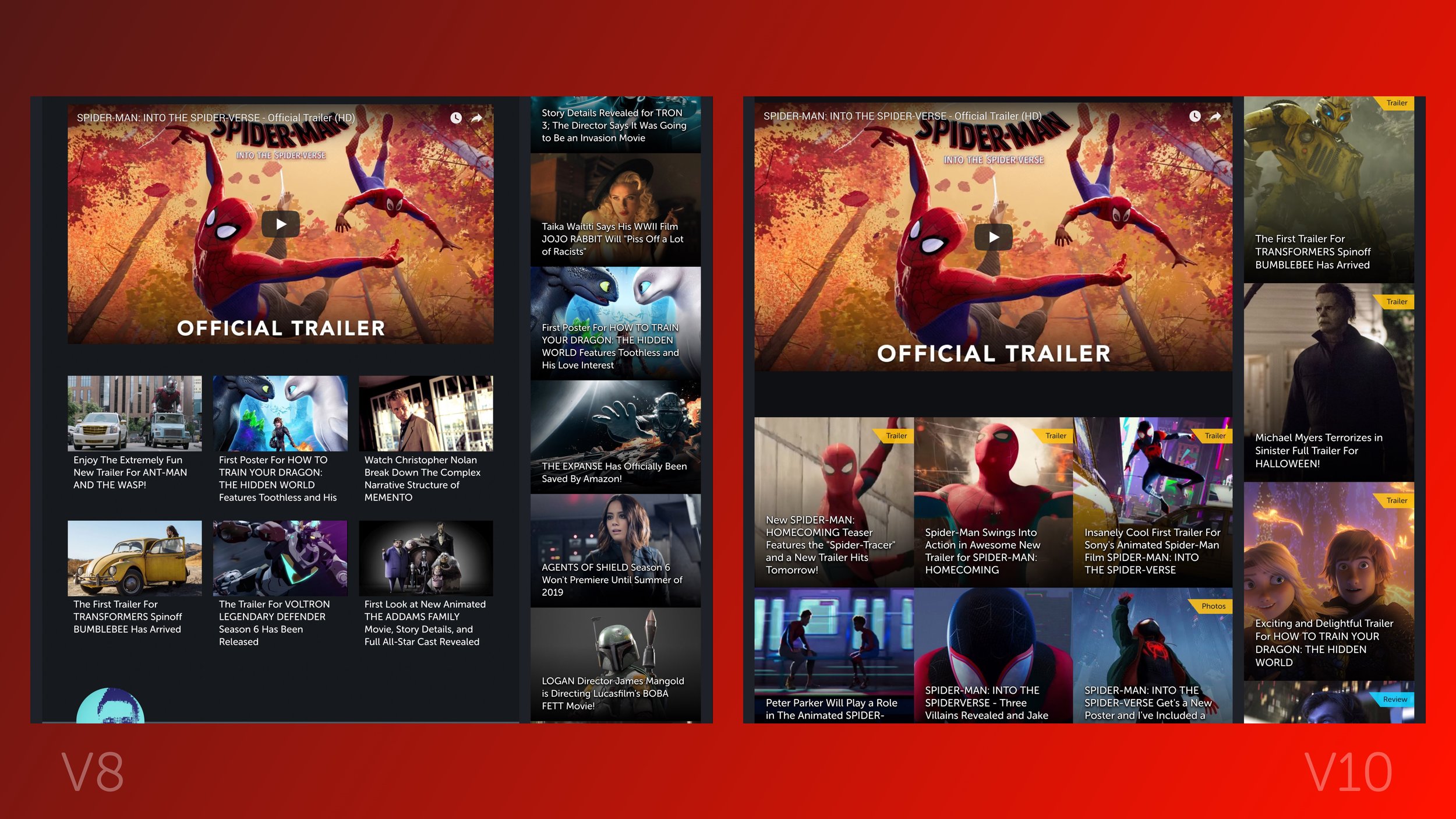
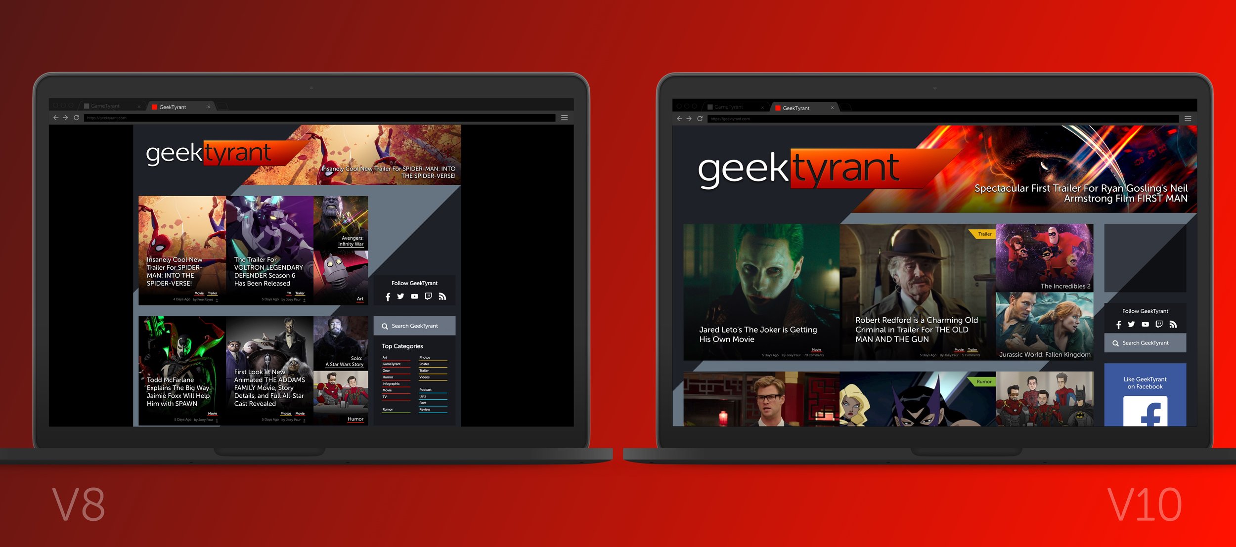
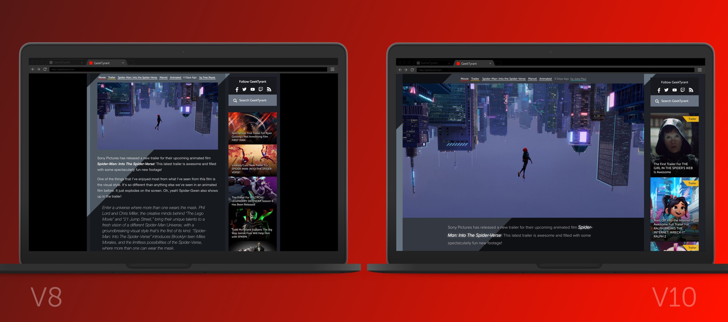
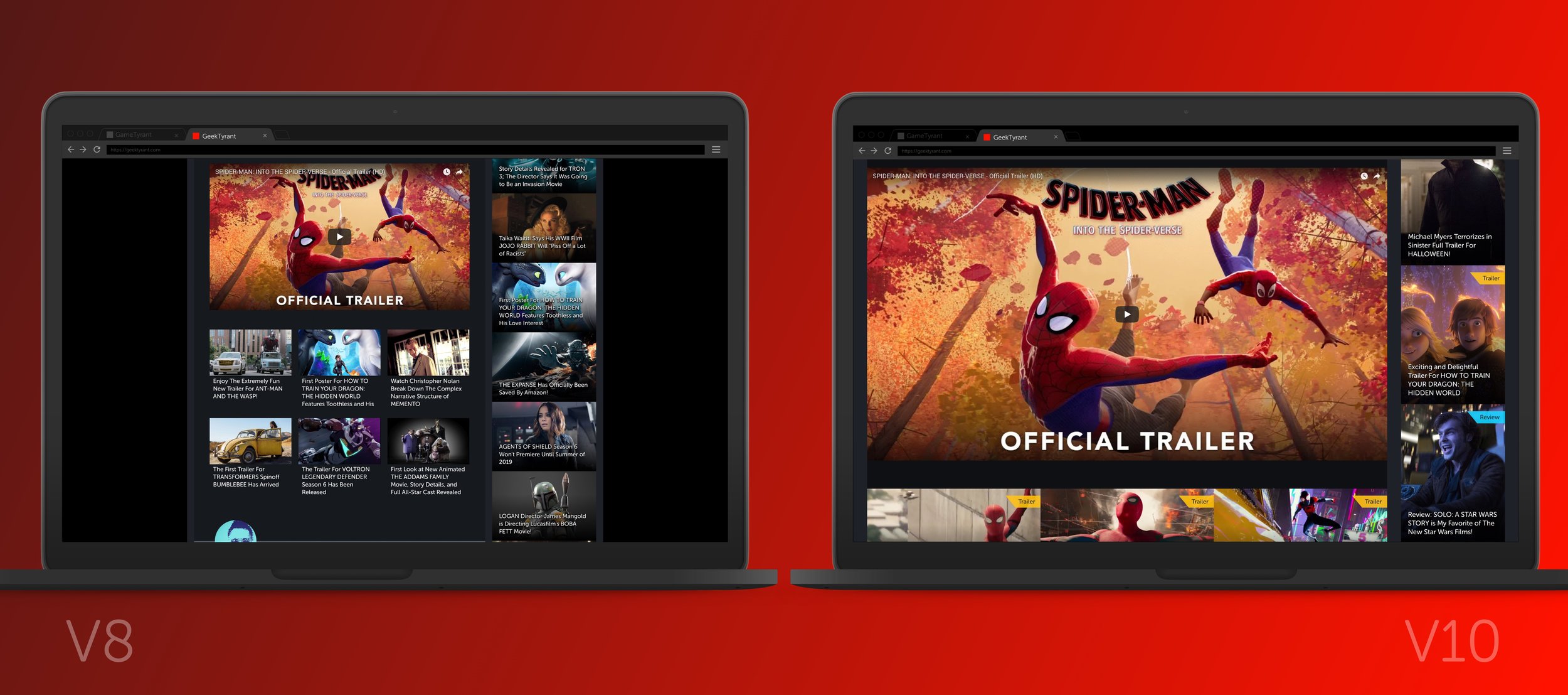
Taking it Widescreen
The most common monitor widths for GeekTyrant readers is 1440px and 1920px. The new fullwidth layout really starts to open up and you get super sized images and videos. This is my favorite new feature of the layout and I have a feeling will be the most divisive as well.
Load Times
Because the fullwidth layout is loading larger images the site does take a bit longer to load. Resizing your browser width to 1200px will return load times to normal. TIP: making your browser window super narrow will make the site load faster. (Images will be super small, obviously)
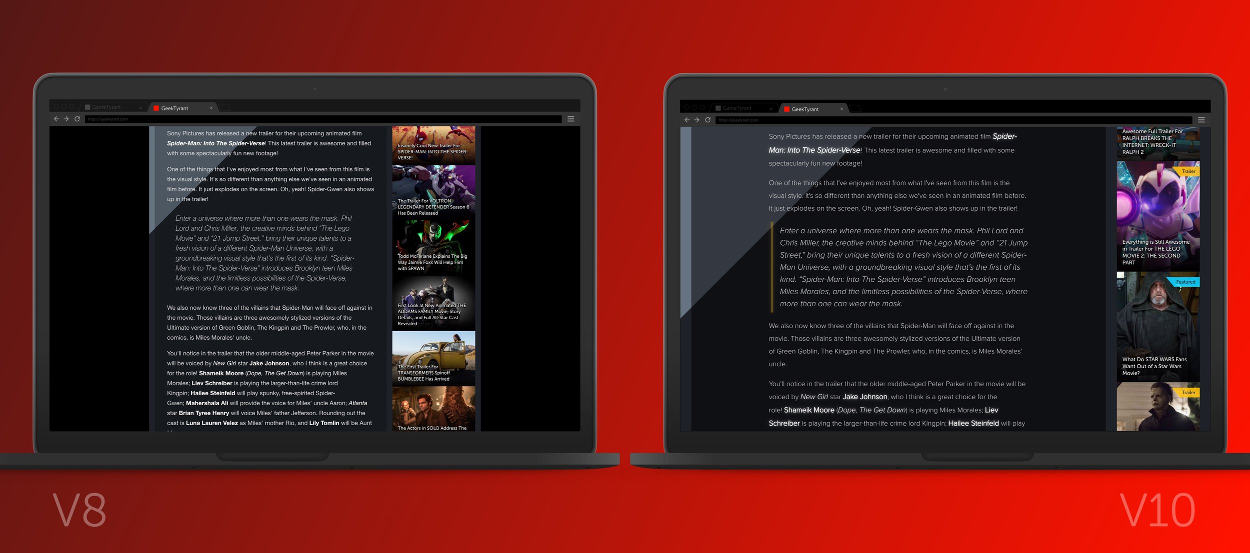
Compromising Full-Width for Usability
Images like posters look insane at fullwidth, so I've locked the max height of images to about 90% of the height of your browser window.
4K Screens
The layout for 4K screens is still evolving, but I think it's easily the best looking site in 4K. I'm still making changes to the layout for 4K screens and working toward optimizing the layout for 5K screens.
Notes for Web Dev Geeks
Only about 5% of code from the old design was used. Everything was redone in CSS Grid and Flex. The design uses custom properties and super heavy use of calc. Using clip-path in a few places and unfortunately, Edge does not fully support it. The custom code for V10 is about 1/3 the size of V8, I'm still refactoring to make the code cleaner.
Listening to Feedback
I'm watching the comments closely on the post and across the site for bug reports. Screenshot of a bug really helps (my email is below). If you don't like the layout or you love it, let me know what works and doesn't in the comments. Thanks for reading the super indulgent post I hope you like the new changes.