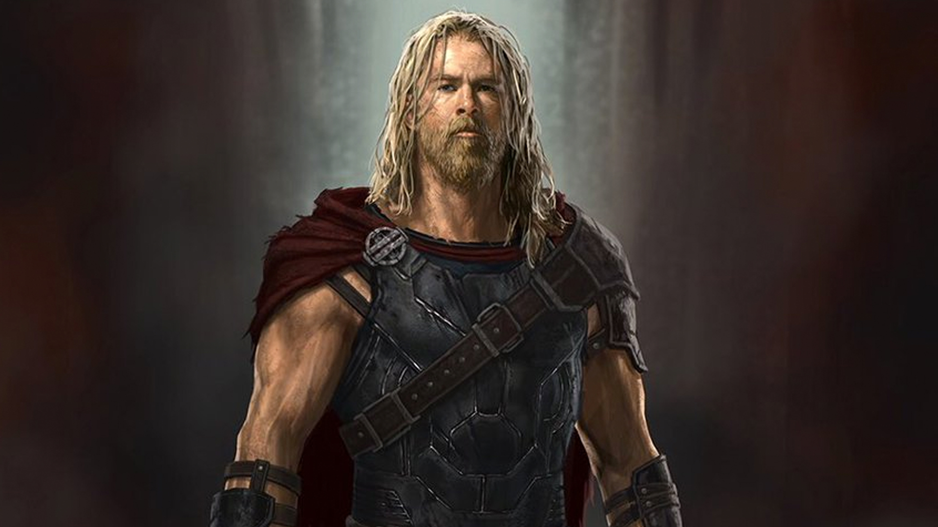
Marvel Artist Andy Park Reveals Awesome Early THOR: RAGNAROK Concept Art of Hela and Thor
Tho:r Ragnarok has come and it's amazing. Everyone agrees... except for those who don't, and those are far and few. I thought it was amazing. I loved the characters and especially the whole look of the character designs. It's even cooler to see how they evolved over the process. Andy Park who worked on the pre-production concept art has recently shared some of his art on Twitter. And it's pretty rad.
One of the images features a worn down Thor. He looks tired, and beat. While it looks great, and very rustic, I really like that they cut his hair and made him more lively. I feel like Thor has evolved as a character from just a stupid bro, to a mopey bro, to a fully fleshed out friend. It's like a guy you can't stand in high school was humbled by the real world and became a cool guy who you hang out with now.
The other image is of Hela when the movie was going for something darker and boy does it look dark. I love what was done in the movie, but this is SUPER cool. I love how prickly it looks. It almost looks like I could cut myself on the picture. Hela was definitely a bit more leathery in the film, but I almost wish that there was more steel and sharp edges. It would have even been cool to see maybe a more war oriented Hela in the battle with the Valkyries scene.
Either way, Andy Park is a great artist. Check out his stuff below.
