Marvel Reveals Character Posters For INHUMANS
Character Posters are so interesting. Sometimes they can reveal a lot, and other times, they can just be like, huh, so that's what people look like. The character posters for Guardians of the Galaxy were great because they were all so diverse and interesting, while Captain America: The Winter Soldier character posters were cool, but also very similar looking.
The character posters for the Inhumans was just released and... well, it's a little of both, to be honest. I'm both excited and disappointed.
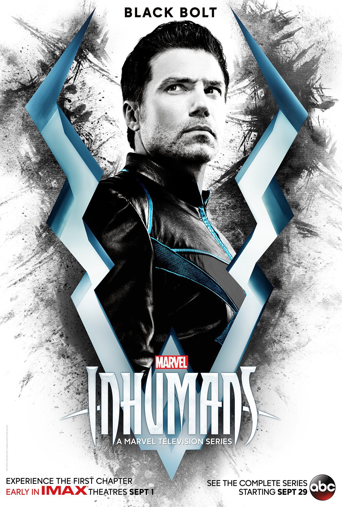
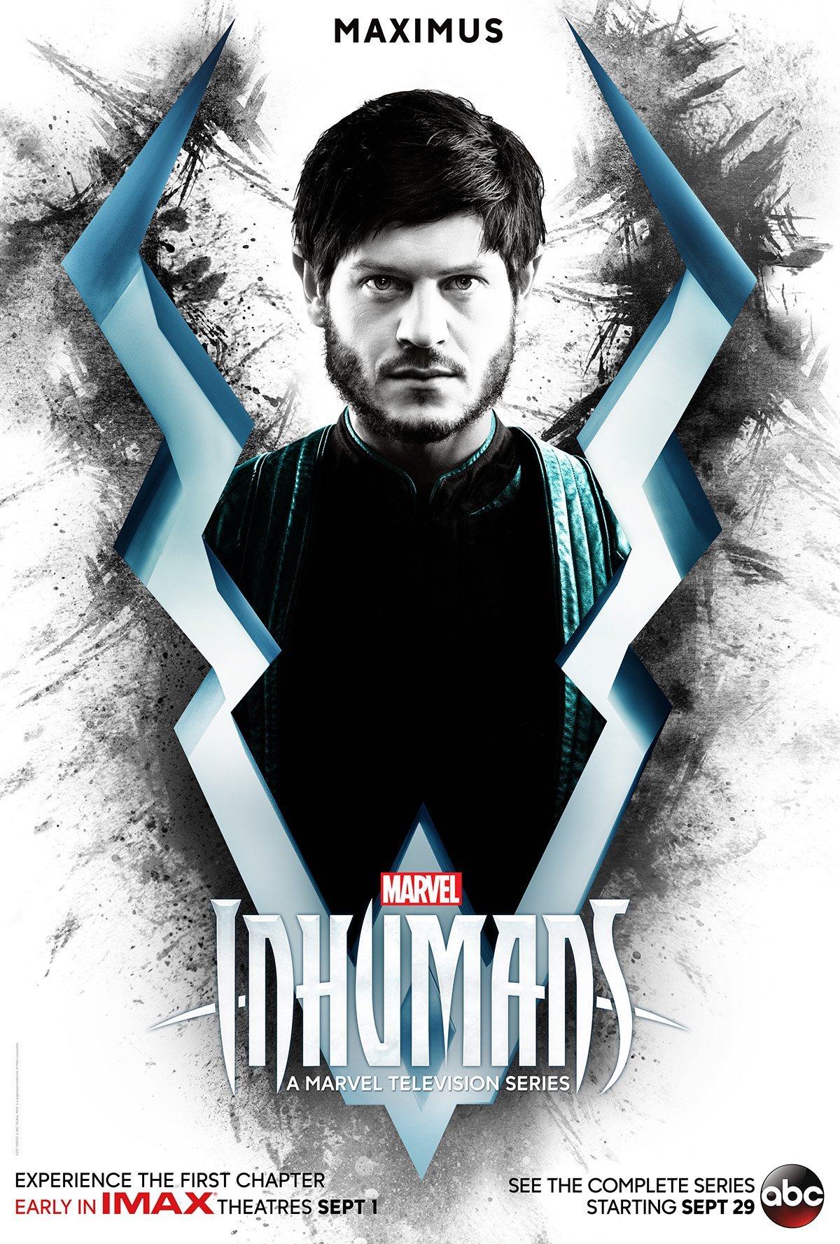
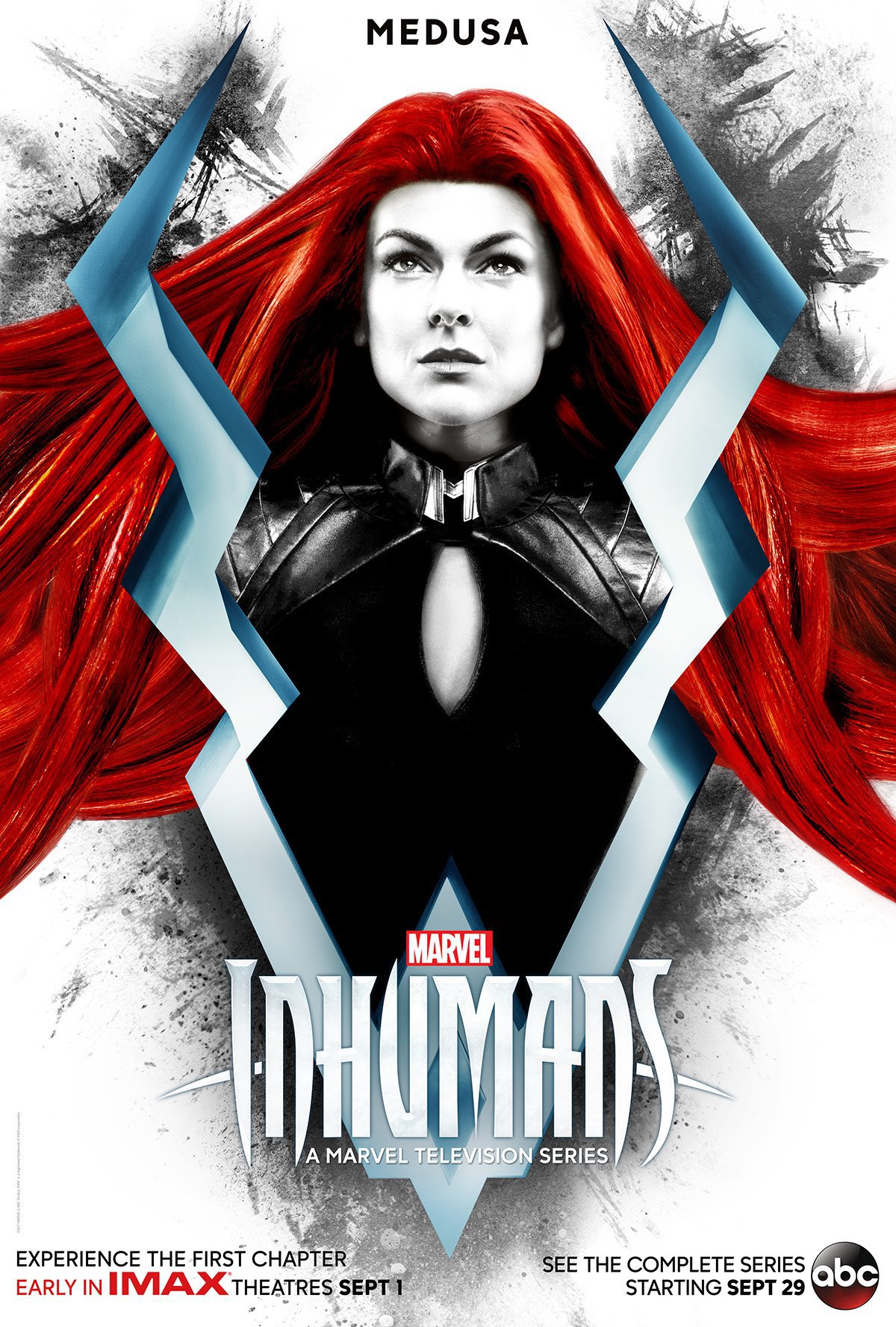
Let's start with the good. First off, the character's faces are pretty powerful. Something that will be very important, specifically for Black Bolt, is how well he emotes without speaking. He looks powerful and stoic. A pose like that often could look like a terrible blue steel, but he manages to pull off a thoughtful stare into the abyss without looking too cliche. The same could be said for Medusa and Maximus. They have a look that tells a story, whether it's hope or destruction. The use of lighting and shadow is also very good in the photos.
Now the down side. While I'm sure it's really cool to some people, black and white with a dash of color seems just very... stupid to me. It's like, whoever did it just learned photoshop and wanted to show off. It's boring with Black Bolt and Maximus and with Medusa it's just too much. In the comics, Medusa's hair is a big deal, but so far all images look like a bad dye job. These images just make it stand out all the more.
The Inhumans are basically the MCU's answer to mutants, and when I think mutant I think colorful and awesome. Unless you're talking about the crappy versions, which is way too leather-clad and dumb... Speaking of which, WAY too much black leather. If these 2017 TV series remind me of the 2000's X-men movies, we have a problem. I want to see diversity and uniqueness, not colorless photos with actors wearing leather.
Everything else is fine. The Rorschach blots behind them and the big tuning fork thing as the symbol is whatever. I could do with or without. I'm hoping the series gets it right. Inhumans should feel like it's tapping into a fantasy sci-fi element like Fifth Element, not Matrix. What do you think? Do you like the posters? Do you think I'm stupid and full of it? Feel free to mock me in the comments. I've gotten used to it by now. I accept that people might hate what I think. Lolwic (Laughing out loud while inwardly crying)