Noah Bailey Shares His Art Process for Working on TREMOR DOSE
Tremor Dose is a new graphic novel by writer Michael Conrad and artist Noah Bailey. The novel appears to be a pretty crazy story and is a comiXology Original available now. Something that’s really cool is that Bailey has shared exclusively with GeekTyrant his process for creating his art. He says:
“My typical art process involves multiple layers of different mediums to build textures and create depth. My process varied quite a bit while working on Tremor Dose. From some panels being fully painted and rendered, to panels using only pen and ink, and everything in between.”
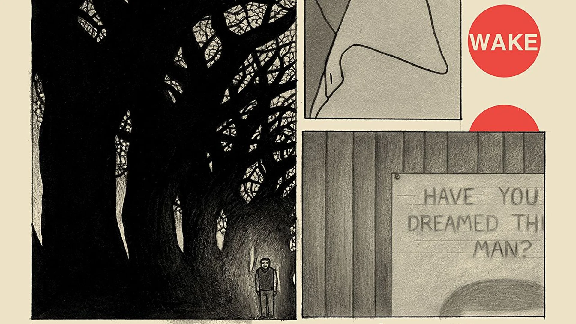
Bailey says his typical process includes five parts. First, he draws a layout in pencil. Then, he inks his drawing. Third, Bailey uses colored pencils to render the different tones of his art. Next comes a watercolor wash, and finally, he uses acrylic paint and colored pencils to render highlights. You can check out how this process works in the images below:


A panel from the first part of the book further helps show how Bailey goes from a layout with simple shading to a finished panel.
“With this panel from the first part of the book, I mostly followed my typical process, using charcoal pencil to create the texture of the shadows, watercolor wash overtop and building tones with colored pencil and acrylic paint.
I personally really enjoy being able to see a bit of the artist’s process on a finished page. Throughout our book you can see that we left in most of the residual pencil marks and blemishes in the panels and in the gutters. There are inky fingerprints and little scribbles everywhere.”


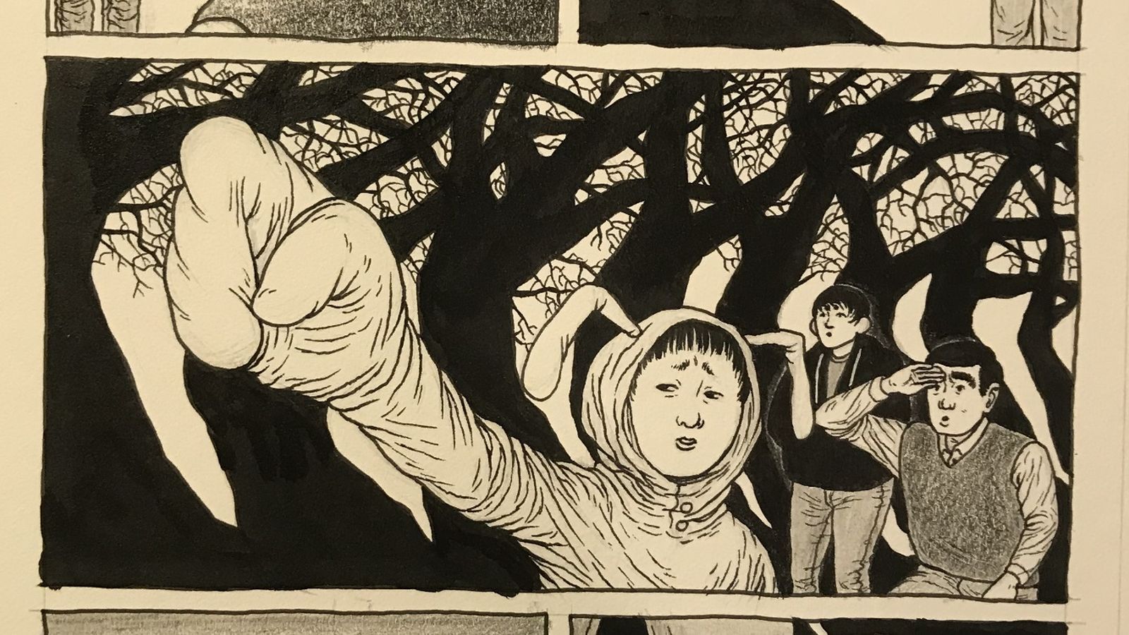
Of course, Bailey does add some color from time to time. For that, he scans the black and white image into a computer and uses photoshop to go from there.
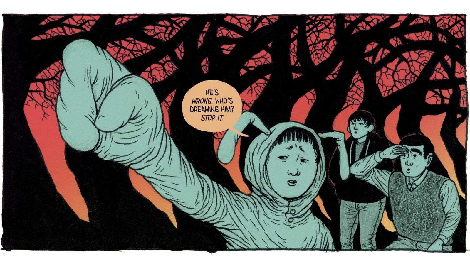
“In the second part of the book we introduced color to some of the sequences, whereas the entire first part is in black and white. This panel is mostly just pen and ink, with a bit of colored pencil and watercolor for textures and tones.
After scanning the physical page, I colored the panel in photoshop. I wanted the colors to be a kind of Technicolor nightmare. Using fully saturated and high contrast color schemes.”
It’s pretty cool to see how artists do their job and this insight has been no different. If you’re really curious about what supplies Bailey uses, you’re in luck as he included a photo of that as well.
