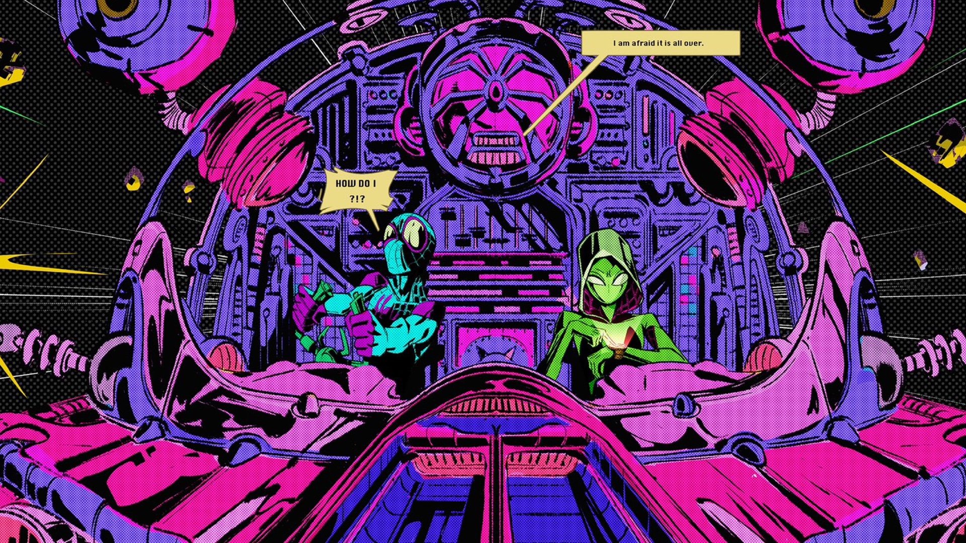
SPIDER-MAN: ACROSS THE SPIDER-VERSE Artist Reveals Cool Jack Kirby-Style Universe That Was Cut
Spider-Man: Across the Spider-Verse took audiences to several different alternate universes that were really cool, but they actually cut what would’ve been one of the best! A Jack Kirby-style universe was designed, but unfortunately never used.
One of the film’s production designers, Aymeric Kevin, shared some early art created for the the Kirbyverse, and after seeing it, I’m pretty bummed out that they didn’t use it! This was a missed opportunity to do something freakin’ awesome and also pay tribute to one of the greatest comic artists that ever lived.
The image features Spider-Man and Spider-Gwen inside what appears to be a ship, and it’s clearly in the style of Kirby, and I absolutely love the colors used! The art came with a note from the artist saying: “Probably one of my favorite image I did on Across the Spiderverse. Freestyle exploration of what a Jack Kirby world could look like. This was just a pitch, not tied to any story.”
Damn… I really would have loved to see this brought to life in the movie! I just love Kirby’s style so much and to see it brought to life in Spider-Man: Across The Spider-Verse would’ve worked perfectly.
