STAR TREK: TOS Would Have Looked Great in Widescreen
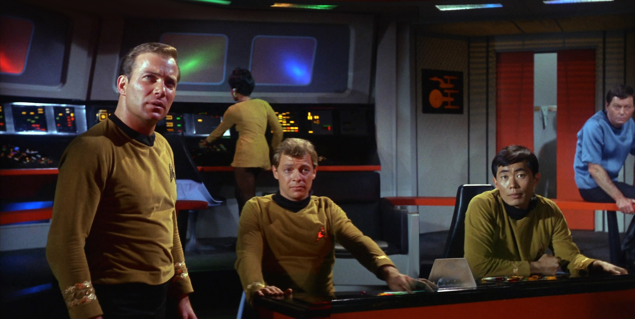
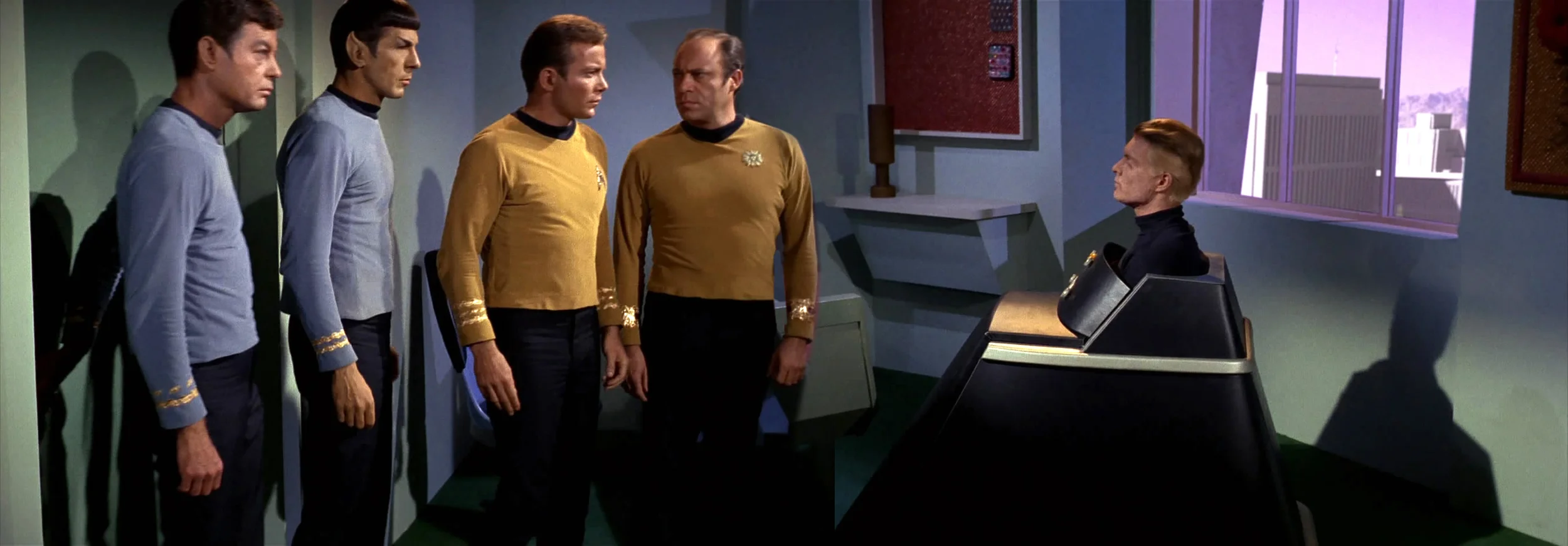
Ever wonder what Star Trek: The Original Series would have looked like had it been shot in the widescreen format now used for television? For being produced in the 1960s this was really a great looking show, and would have looked awesome in widescreen with all of its spectacular visuals. It's just stuck in that old-school 4x3 format, but artist Nick Acosta unlocked it, and came up with a great idea to take some scenes where the camera panned in a shot and merge it together into one image. Here's an explanation from Acosta:
"Using HD screen caps from my friends at Trekcore.com, I created this project of what the show would have looked like in Cinerama widescreen. As a kid the show always felt bigger and more epic than it appears to me as an adult. I was able to create these shots by waiting for the camera to pan and then I stitched the separate shots together."
As you'll see, the results are epic and stunning. It's been so long since I've seen the series, I forgot how colorful it was! It was a nice treat to see these. Thanks to Badass Digest!


