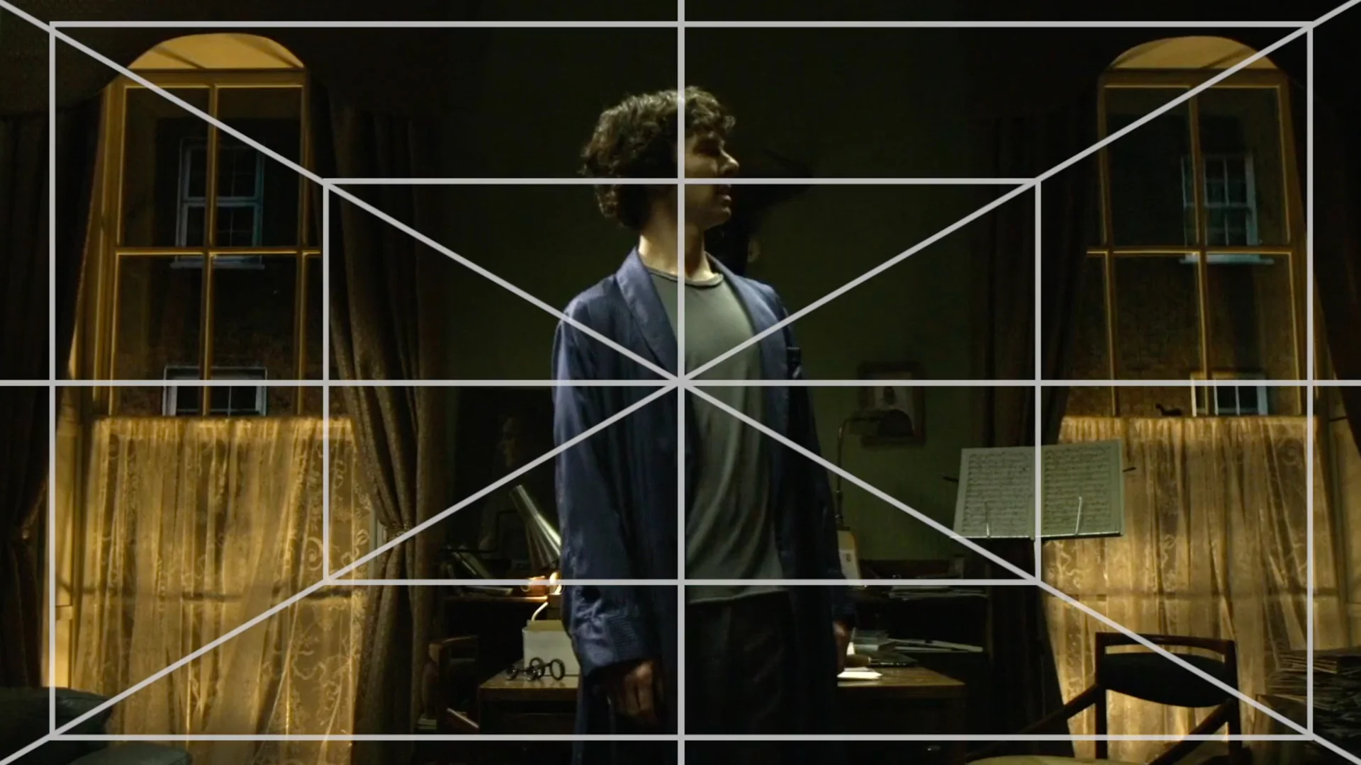
Video Explores SHERLOCK's Use of Symmetry
Because of the show's unusual air dates and length of episodes, I feel like Sherlock is a series that's becoming harder and harder to feel as if the audience is having a normal viewing experience when we watch it. It doesn't seem to command the cultural discussion in the same way more traditional shows do, even though it often operates on a higher quality level than a lot of things on television. But I suppose that's part of what makes it special, and burning through those 90-minute episodes is a joy every time new ones pop up.
One of the areas for which the show has always been properly praised, though, has been its cinematography. It's truly a beautifully shot series, and in this quick video essay from Celia Gomez (via LaughingSquid), the editor showcases the directors' excellent use of symmetry, which often serves as a visual way to level the playing field between Sherlock and his adversaries. Season 4 is supposed to debut sometime next year.
