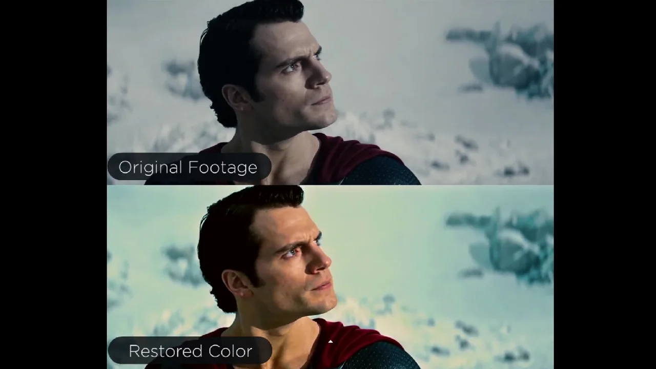
MAN OF STEEL Color Comparison Shows A Much Brighter Superman
Update: Wow. Apparently VideoLab straight up lied about the fact that they didn't alter any of this footage. According to this piece, they darkened up the footage considerably to make their comparison look better. I apologize for not checking this myself. Original article follows.
I really liked a lot of elements of Zack Snyder's Man of Steel. I thought Henry Cavill and the rest of the cast were fantastic, the action was awesome, the visual effects were impressive, and the score was pulse-pounding and satisfying. I wasn't a big fan of the way Superman effectively murdered millions of people by omission in the final confrontation with Zod, but from the early discussions about Batman V Superman: Dawn of Justice, it appears that movie will handle the fallout from his action (or inaction) as a major plot point, so I'm willing to see where they go with that.
One thing a lot of people complained about was the desaturated visual palette. In comparison with Richard Donner's brightly colored classic, this movie appears unnecessarily bleak, capturing more of the Dark Knight look than anything that was associated with Superman up until that time. VideoLab (via Collider) decided to tweak the colors in the footage and present a side-by-side comparison of the real footage with their lightened version to give fans an idea of what we could have had if Snyder had decided to go a different way with his film. I'm not convinced the lighter version is the only way to go — Superman doesn't necessarily have to always be bright and colorful in my opinion — but it's definitely a diametrically opposed view from what we got in the final film. What do you all think?
