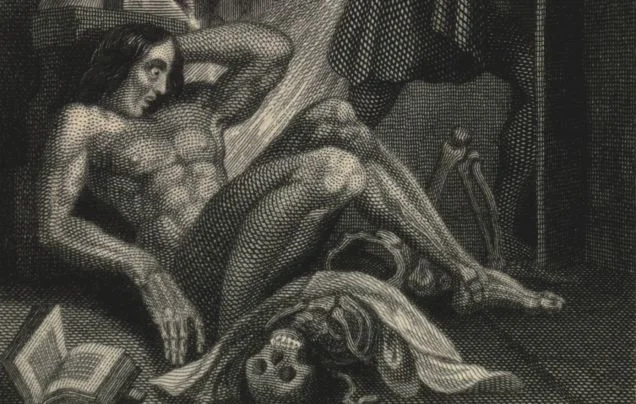
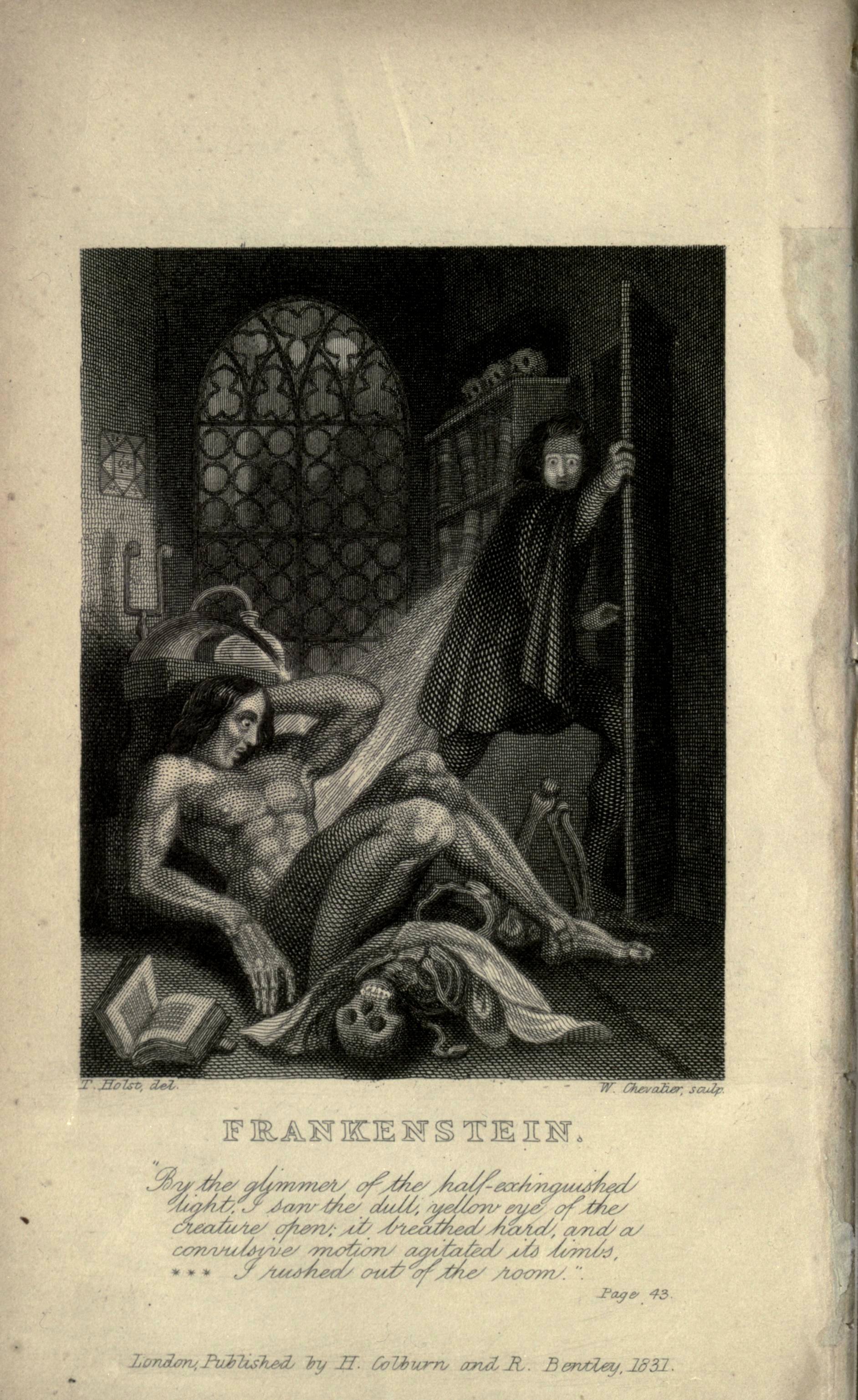
See the Original Illustration of Frankenstein's Monster
Frankenstein’s monster is so familiar to us that we don’t even call him by his actual name. He preferred Adam, but we just call him Frankenstein, even though that was the name of the Doctor who created him. But it’s the monster, not the doctor who has taken hold in the popular imagination, and we’ve seen versions of him ranging from Boris Karloff to Herman Munster to this arthritis commercial (my all-time favorite prescription drug ad). This, however, is the original iteration, the frontispiece illustration from the first edition of Mary Shelley’s horror classic. Rather than the green stitched up skin quilt with neck bolts that we know and and love, he looks like a pretty normal guy, albeit oddly feminine.
The illustration is on display at The British Museum as part of an exhibit called "Terror and Wonder: The Gothic Imagination." There are also various other imaginings of the monster on display, tracking the evolution of the figure. Greg Buzwell, curator of the British Library, said,
"In the book, the Creature is almost sympathetic. In the film, although we do get the sense he is misunderstood, the intention was to have a character who was quite frightening - hence the beefed-up physique, the clumpy boots, the macabre stitches and the bolts through the neck. He became a menacing figure.
"The Creature in the 1831 illustration is fairly close to what Shelley had in mind."
The Exhibition ties in with the BBC’s “Gothic Season” a spate of programming including A Dark and Stormy Night: When Horror Was Born, about Byron’s challenge to Shelley that led to the creation of Frankenstein. Maybe that'll come stateside soon.
Source: The Telegraph via io9


