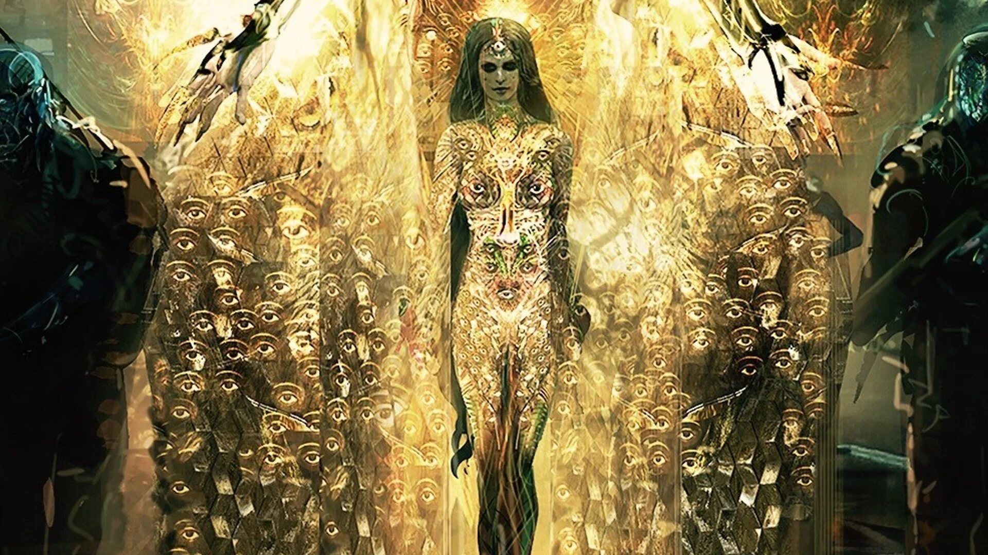
Director David Ayer Confirms How He Wanted Enchantress To Look in SUICIDE SQUAD with Concept Art
Suicide Squad director David Ayer would really love to share his original vision of the film with the fans, just like Zack Snyder is getting to do with Justice League on HBO Max. Will Ayer get that opportunity? We’ll just have to wait and see, but there have been rumors that it might happen.
When previously talking about the film, Ayer said: “My cut would be easy to complete. It would be incredibly cathartic for me. It’s exhausting getting your ass kicked for a film that got the Edward Scissorhands treatment. The film I made has never been seen.”
The original cut of the film included “a lot more Joker including a big fight with him in the subway.” It was also explained that the beginning of the film “wasn’t edited like a music video, as all of the flashbacks happened in chronological order.” One of the most important aspects of his original cut was that there was “a very different and clear tone to the Joker and Harley’s relationship, which actually fits better with the opening of Birds of Prey.”
Now we are learning today that Ayer had a completely different look in mind for Cara Delevingne’s Enchantress. A fan shared some early concept art that was created for the film and Ayer responded to that saying, "This is where I wanted to take her look."
It a pretty cool visual look that would have been awesome to see in the film! It looks much better than what we ended up seeing. It’s a beautiful character design! I wonder why they didn’t end up using it.
Check out Ayer's comments and the Suicide Squad concept art below:
